Crypto Connect
Brand Identity & Logo Refresh
Graphic Design, Brand Positioning, Strategic Visual Storytelling, Market research
The company’s original logo and branding felt dated and generic — a blocky “C” with minimal visual hierarchy and no clear story about innovation or digital value exchange. It lacked scalability for digital platforms and didn’t differentiate the brand in the crowded fintech/crypto market. So I evolved it from generic crypto mark to a modern, digital-first identity.
the process
-
the process -
To ensure the new identity felt relevant in the crypto/Web3 ecosystem, I conducted a competitive visual audit of brands such as Solarr, Cinchblock, Blackpanda, Fireblocks, First Digital Trust, and Imperium Empires. I analyzed their use of geometric forms, monograms, circuit-inspired elements, and simplified coin silhouettes to understand how leading players signal technology, security, and innovation while staying clean and scalable.

CinchBlock Logo
First Digital Trust Logo

Solarr Logo

Blackpanda Logo

Imperium Empires Logo
Brand Guide

typography
hex #F77402
hex #F59F00
hex #FFFFFF
hex #000000

original


final
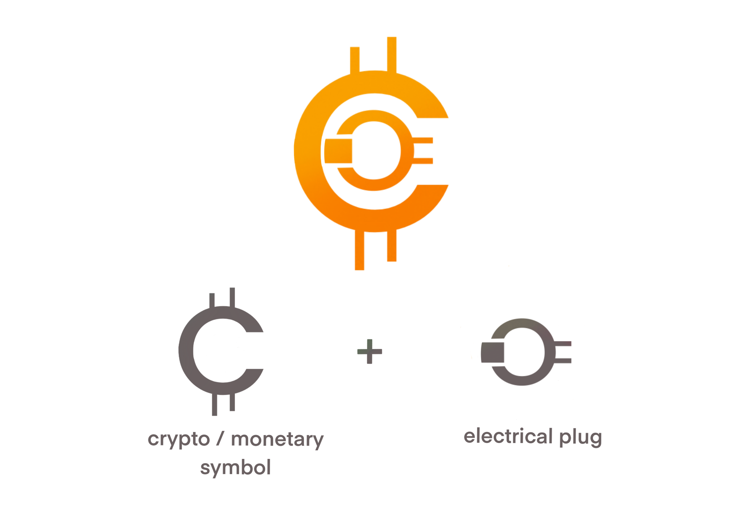
I wanted to fuse the familiar form of a monetary symbol with the shape of an electrical plug to reflect both the company’s name and its core values. The plug symbolizes the digital age and technological connectivity, aligning with the brand’s mission as a Web3-focused recruitment platform that connects digital-first talent with emerging, innovative companies in the blockchain space. This combination creates a mark that is recognizable, future-focused, and rooted in the idea of powering new opportunities in the digital economy.
other digital assets